ZETAP SOZAI / yureloop30 / 日本語
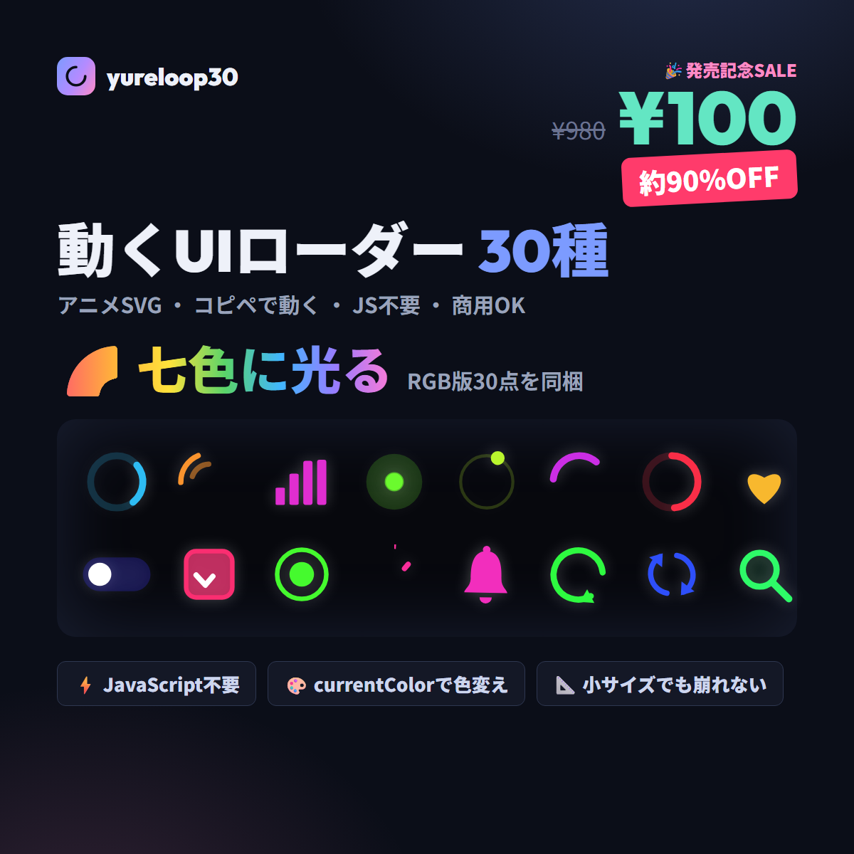
yureloop30
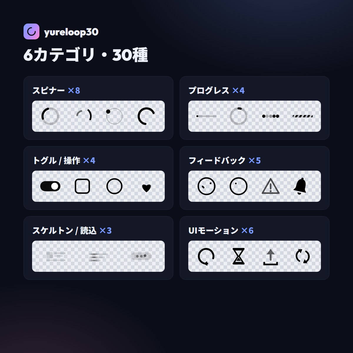
Animated seven-color UI loaders · 30 designs
From spinners and progress bars to toggles and feedback icons — 30 animated loaders for real UI use.
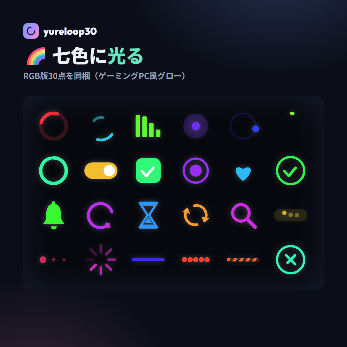
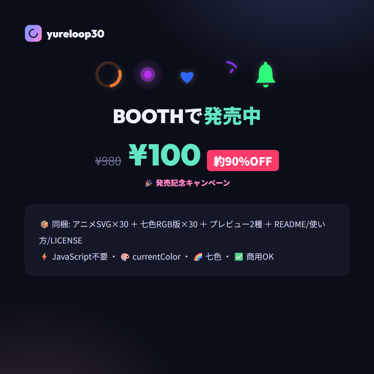
currentColor support inherits the parent element's color. Includes 30 seven-color RGB versions too. Just paste with `<img>` and it animates.
¥100¥980Launch offer · approx. 90% OFF
Buy on BOOTH →
Features
Just paste it
CSS animation is embedded in the SVG. Animates with
CSS animation is embedded in the SVG. Animates with
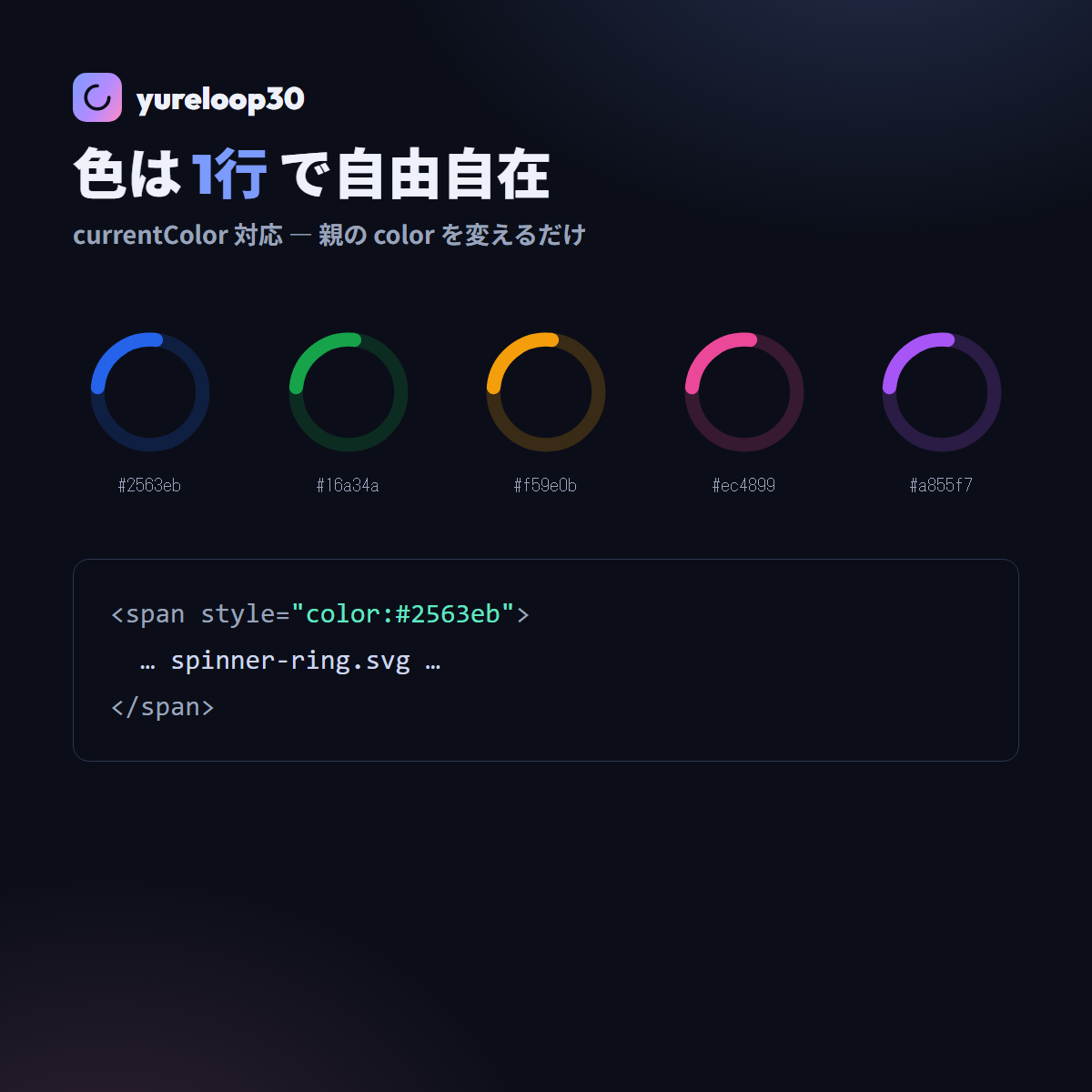
<img> (no external JS/CSS)Recolor freely
currentColor support. Placed inline it follows the parent's
currentColor support. Placed inline it follows the parent's
color / seven-color RGB versions also includedLightweight SVG
Optimized paths in a 100×100 viewport. Retina-ready, no loss when scaled up
Optimized paths in a 100×100 viewport. Retina-ready, no loss when scaled up
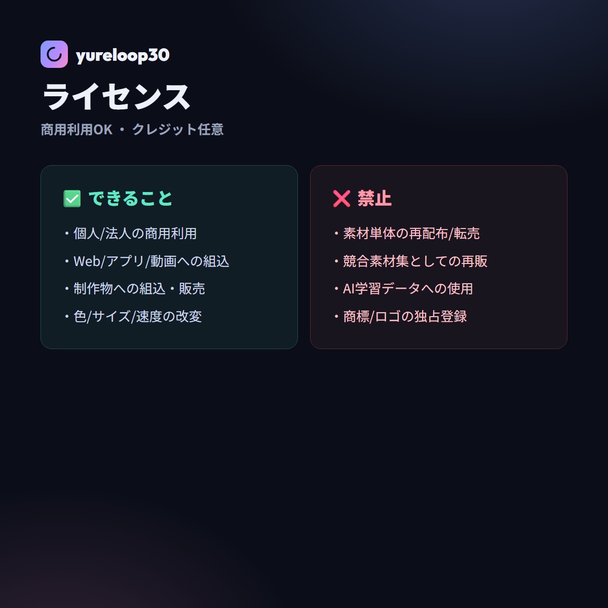
Commercial use OK
Commercial use & modification OK in your work (redistributing the assets themselves / AI training not allowed)
Commercial use & modification OK in your work (redistributing the assets themselves / AI training not allowed)
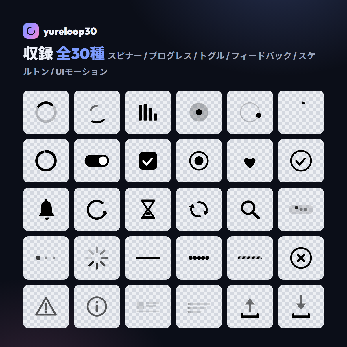
See all 30 in motion click to change color
Gallery
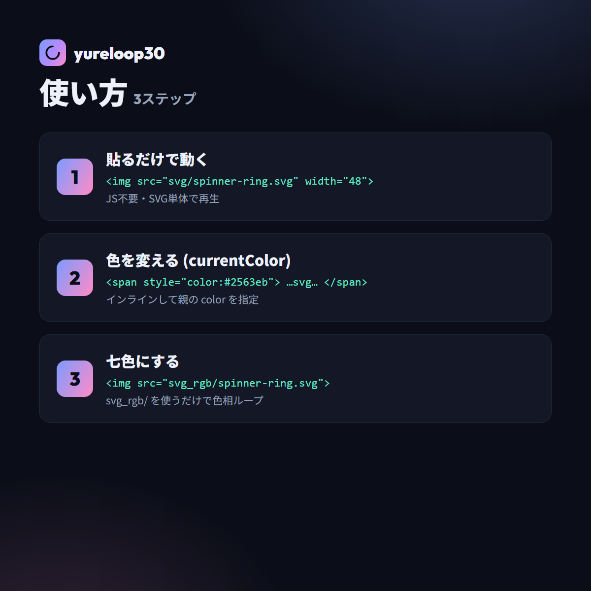
How to use
<img src="svg/spinner-ring.svg" width="48">            <!-- animates as-is -->
<img src="/showcase/assets/yureloop30/svg_rgb/spinner-ring.svg" width="48">        <!-- seven-color RGB version -->
¥100¥980Launch offer · approx. 90% OFF
Buy on BOOTH →